Interview with artist, Lorenzo Colangeli

Let’s start at the beginning of the road. How did you first find your way into illustrating board games, and what drew you to this particular project (The Hobbit: There and Back Again™), as an artist?
It started the same way the book of The Hobbit™ does — as an unexpected adventure! My very first board game job was with Iello, a French board game publisher I still collaborate with today, and that experience made me discover how wonderful it is to work on projects like this. I’m a comic book artist and character designer as well as an illustrator, and I can honestly say that working on board games is my favourite thing to do.
So, being a huge Tolkien fan, working on this game felt like a dream come true. I was thrilled to learn that some Tolkien-inspired work I had shared on my social media caught the attention of the asmodee team, and that’s what gave me the chance to start this journey alongside my favourite fictional characters.
What does your creative process look like when designing artwork for a board game like this? Was there anything you did differently for this game?
I’m not really a “this-is-my-style” kind of artist, if you know what I mean. Of course I have my own artistic language and a comfort zone, but I always try to experiment and find a balance between my personal vision of a world and the original source material — that’s crucial to me.
That’s why, with each project, I try to build a visual language that carries my perspective while also giving the world its own identity that can stand on its own.
Middle-earth has such a rich visual legacy, how did you approach the art for this project? And how did you balance staying true to Tolkien’s world, while still bringing your own artistic voice to the table?
This connects closely to my previous answer. What really helped me was being a fan of the books rather than other The Hobbit content — that allowed me to merge the visual language commonly recognized with what I had always imagined certain characters to look like. I didn’t want to radically change what has now become a deeply ingrained visual identity in all of our minds. I felt it was important to show respect to the work so many artists had done to bring Tolkien’s world to life. Again, it’s all about finding a compromise — creating a dialogue between my own vision and what can now be considered the traditional look established by existing content.
Further to that, Tolkien’s world is full of atmosphere and emotional range, from humor and curiosity, to quite dark and moody. The artwork for The Hobbit: There and Back Again is described as whimsical, and created a “cozy” feeling for players. Was this a conscious decision you set out to achieve, or did it evolve along the way?
It was a very conscious decision, and it ties back to what I mentioned earlier. The Hobbit as a book is quite different from The Lord of the Rings™ — it has more of a fairy-tale quality, a bedtime-story feel. Other The Hobbit content, on the other hand, has leaned into a darker, more serious tone. So what I tried to do was take the characters from the various renditions and bring them back to the spirit of the original book — and I’m so glad that approach has been well received.
In The Hobbit: There and Back Again, we go on quite the journey from the Shire to the Lonely Mountain! Were there particular locations, characters, or moments from the story you were especially excited to bring to life visually?
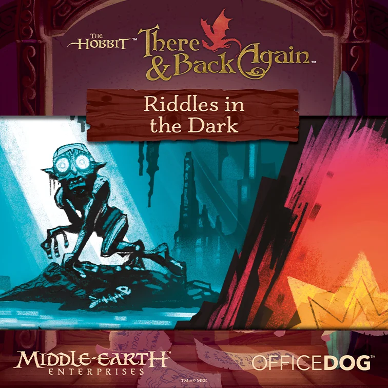
I’d say Gollum’s cave and Smaug’s lair are the chapters I most enjoyed working on! Both Gollum and Smaug are my favourite Tolkien characters, so getting to give those scenes a personal take was the best.
Board game art has a really unique challenge to it. It has to be beautiful, but also functional for gameplay. How did you approach creating art that both captures the spirit of the adventure, and helps players navigate the game clearly?
It was quite a challenge, and I managed to tackle it thanks to Bree (Woodward, Office Dog Games Creative Director) and the incredible team who helped me understand both the gameplay mechanics and the atmosphere they wanted players to experience. I really can’t thank them enough for that guidance.
If you had to pick one piece of art from the game as your personal “precious”, which illustration would it be and what makes that one special?
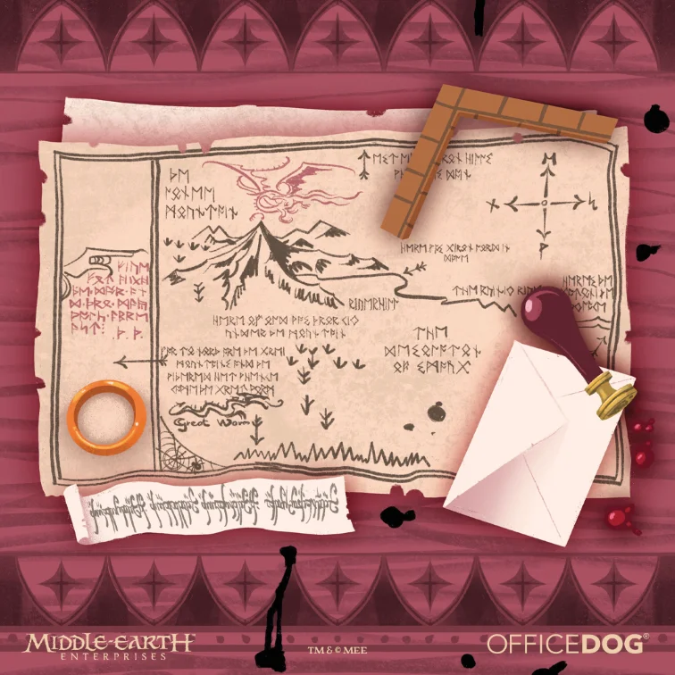
It might come as a surprise, but the illustration I’m most proud of is the interior of the box! The team gave me total freedom to create some decorative elements, but I wanted to give it a proper look that truly felt in keeping with the game’s concept. Given the shape of the space, I thought recreating Bilbo’s desk would be a perfect fit. I was genuinely moved when I received a copy of the game and saw the final result in real life.
Looking back on the journey of creating this game, did anything surprise you along the way? Whether creatively, technically, or in terms of how players have responded to the art?
I have to admit I couldn’t quite picture what the final experience of playing the game would be like, especially because of its unique mechanic where you draw your path directly on the maps. I was worried things might not be easy to read. But the first time I played through each chapter, I was amazed by how intuitive everything felt — and by how clean and simple the overall impression was, even though each page of the board-book contains a lot of elements.
As this adventure draws to a close, what artistic paths or projects are you exploring next?
I’m currently working on several projects — board games included — for various publishers around the world. But the thing I’m most excited to announce is that I’ve finally found the courage to start developing my own board games! It’s more of a hobby for now, but I hope to one day see them sitting on a shelf in a game store.
Visit Lorenzo’s artstation portfolio here to check out more cool art!